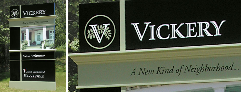
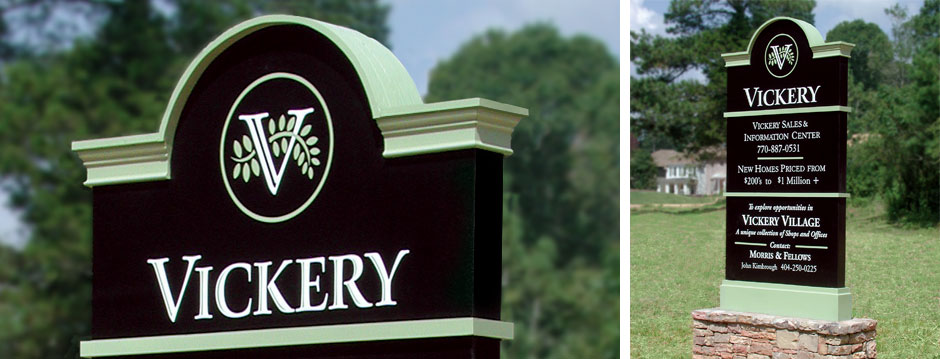
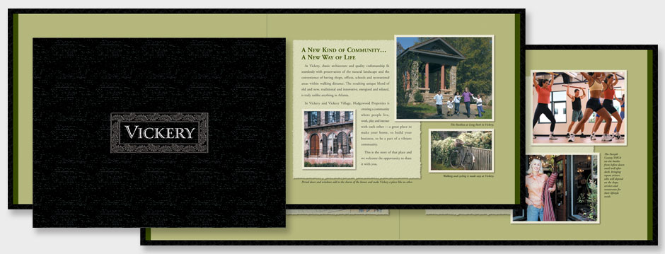
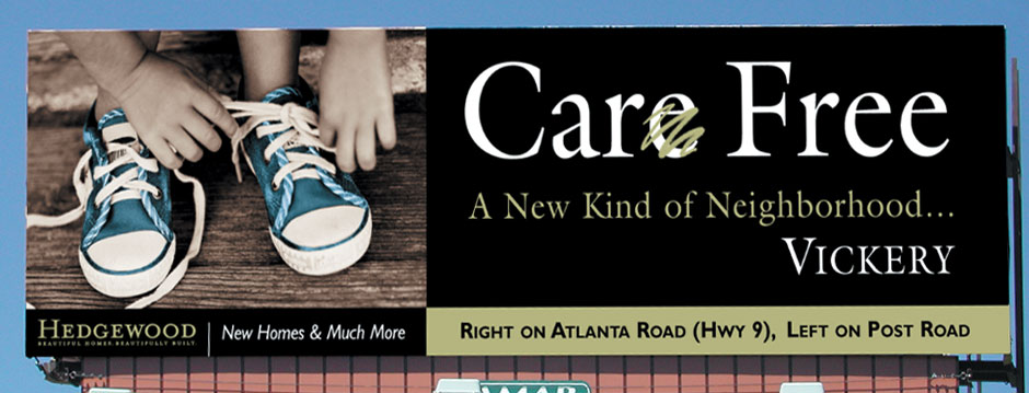
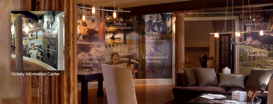
Vickery set the standard as Atlanta’s first ‘Live, Work & Play’ community. This new way of living, and the emphasis on protecting the environment makes Vickery unique. Because Vickery is not set in a densely populated urban setting like other new urbanism developments, its location in a suburb north of Atlanta redefined the category. The branding and marketing had to stand out, be different and be presented in a new way. The logo, signage, sales center and advertising all had to be real and convey the sense of connectivity to your neighbors and the environment.
The Vickery logotype is a customized font, designed to look hand crafted and timeless. The logo icon initial ‘V’ is meant to represent the architecture and the man-made structures of the community. The intertwined leaf represents the way the community was designed and built in harmony with the environment. The marketing used rich earth tones colors and sepia toned images with hand tinting to convey a simpler way of life. The theme of walkability, community and environmental stewardship permeated all aspects of the visual communications and marketing of Vickery.

