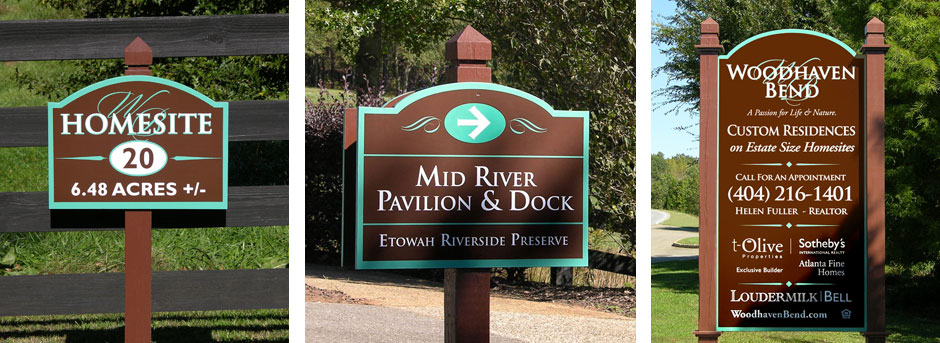
The rebranding of Woodhaven Bend began with the creation of a new logo. The look needed to be honest and elegant, the use of a strong serif font representing the classic architecture is accented by the soft flowing initials representing the Etowah River which encircles this naturally beautiful property.
The website was created using organic textures and colors to convey the natural beauty of this idyllic setting. Large images and concise copy all help quickly tell the story of Woodhaven Bend. The marketing collateral was created with the same design esthetics allowing visitors to take home a beautiful reminder of their experience touring the community.